These Typography Tips are a Must for Mastery
If you want to be a great graphic designer, you’re going to need a deep understanding of, and facility with, type. It takes practice and experience, but the path to mastery is not a mystery. Here are 12 typography tips for beginners looking to level up.

1. Understand font families
The first and most versatile tool in your font tool belt is the font family. Most modern fonts do not exist in isolation, but as part of a set of closely related font treatments. Using such related fonts can help develop unity in your designs.
Well-organized typography is an integral part of good graphic design. Learn how to do it right in Graphic Design: Type with Timothy Samara.

2. Use few fonts
Strong visual typography uses a limited number of font families, and no more fonts within them than necessary. Most experienced designers agree that a practical limit for font families is three. Some designers advocate restricting designs to serifed or non-serifed fonts; others believe headings versus body content justify bridging the gap. The basic rule is simple: Less is more. Don’t believe us? Ask James Victore, living legend in the world of poster design:
3. Respect font integrity
Never distort the shape or natural dimensions of a font, unless it’s being used for a specific purpose. Fonts are carefully designed, and distorting them destroys the harmony that others spent months or even years perfecting.

4. The art of kerning

The area where you can, should, and must interfere with the natural order of fonts is in kerning. While fonts may be optimized to beautify particular combinations of letters, compromises are unavoidable, and even the best automated kerning cannot eliminate awkward spacing. Kerning is an art that deserves its breathing room.
source: http://www.uwec.edu/help/indesigncs3/advaform.htm?utm_source=CMblog&utm_medium=link&utm_campaign=what-is-kerning
5. Hierarchy: How thinking gets done

Establishing logical hierarchies is one of the most important functions of type. Clearly distinguished font sizes and selections establish a logical content order within your design. Type helps readers identify the priority order for reading and understanding. You can’t communicate effectively without that.
6. Get on the grid

Learning to use a grid system helps create hidden harmonies in your typographical layouts.
7. Compare and contrast

Black and white, shades of gray and color balance all impact how your fonts will read. Laying type over photography, graphics, patterns or illustrations is an exercise in establishing and maintaining readability and visual pleasure.
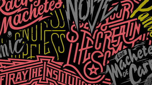
8. Improve hand lettering

Every designer will come across projects that demand a human touch. Not only is hand lettering (with digital cleanup) the best way to achieve certain effects, but it’s also the best way to teach yourself to look at and select fonts critically.
9. Build a font to build understanding
Once you’ve introduced hand lettering into a few projects, you’ll start to wonder if these great fonts can live on. This is the best sign that you are ready for the painful yet profoundly satisfying process of designing a font. You can’t get much deeper understanding of fonts than by building one of your own.

10. Change your perspective
Effective typography has a harmony and balance that results from rigorous visual attentiveness. You can better judge your own work by changing your visual perspective. Make a habit of flipping a design upside down, looking at a mirror image of it or viewing color designs in grayscale. If it doesn’t satisfy, tinker. You’ll learn a lot in the process.
11. Build it to scale
A surprising range of typographical designs must function at multiple sizes. Output your work at least two distinct sizes to make sure the design scales.
12. Never stop learning
Mastery challenges itself. To become a master of typography, you must maintain a high visual metabolism. Take a typography for beginners course if you’re new to this art; read design and typography books; check in regularly with Web publications that make creative use of typography and expand your boundaries.
Are you ready for the biggest Photoshop event of the year? Join CreativeLive for Photoshop Week 2018 to learn how to produce professional quality photos and reach your full creative potential. RSVP Today.